2 Time Series and Quadplots
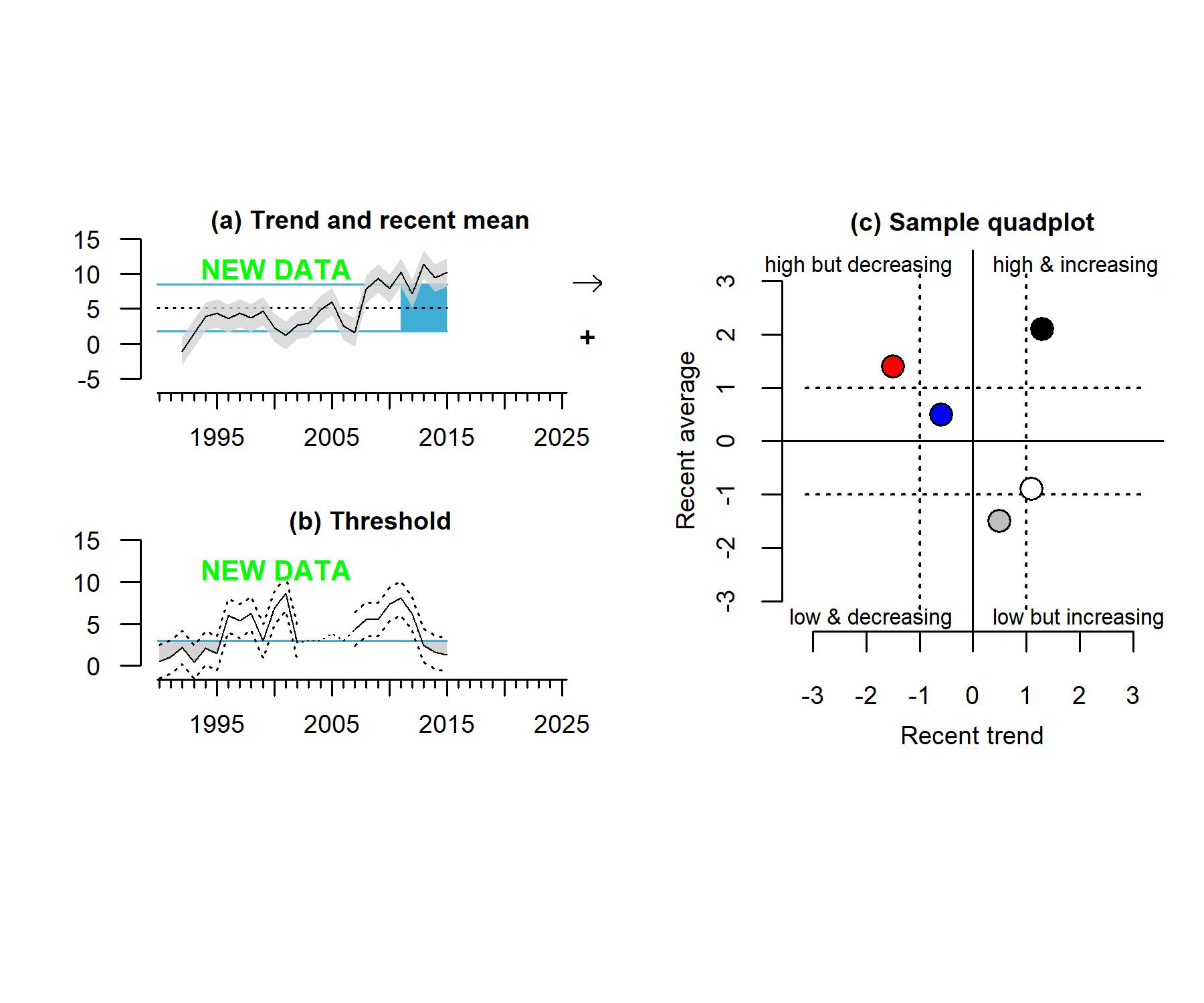
Methods The California Current Ecosystem Status Report uses a standard time-series and quadplot format for many data streams (Fig. 2.1).
The standard time-series plot (a) shows indicator data relative to the mean and ±1.0 standard deviation of the long-term statistical evaluation period–set to a “climatology” period of 1991-2020 for all time series to match climate and oceanographic approaches. Black points (when included) indicate data, whereas dotted black lines are used to indicate missing data. The arrow at the right indicates if the trend over the evaluation period (shaded blue) is positive (↗), negative (↘), or neutral (↔︎). The symbol at the lower right indicates if the recent mean was greater than (+), less than (-), or within 1.0 SD of the long-term mean. When possible, times series indicate observation error (gray envelope), defined for each plot (e.g., SD, standard error, or 95% confidence intervals).
In some cases where the indicator has defined threshold values (e.g., hypoxia or domoic acid toxicity levels), the time-series plot (b) shows the indicator data relative to these threshold value, indicated with a blue line. In this case, dashed lines indicate upper and lower observation error, and the dotted black lines indicate missing data.
Sample quad plots (c) are also used in some other cases (e.g., streamflow), where each point represents one normalized time series. The position of a point indicates if the recent trend (x-axis) was increasing or decreasing over the evaluation period and whether the recent mean (y-axis) was above or below the evaluation period mean. Symbols fall therefore fall into quadrants based on recent average (high or low) and recent trend (increasing or decreasing) relative to a defined, long-term evaluation period.